Exercise 4: ggplot
After working through Exercise 4, you’ll…
- be able to see a problem and customize a scatter plot with
dplyr&ggplot2to solve it
First, load the %>% (World of Journalism) dataset from the tidycomm
package. Install tidycomm if you haven’t already and then assign the
WoJ dataset in its own R object:
If you want help to solve this exercise, here’s a step-by-step tutorial that I’ve once created for my students:
Task 1
Try creating your own scatter plot. First, load tidyverse to access
ggplot2 for data visualization:
Show how journalists’ work experience (work_experience) is associated
with their trust in politicians (trust_politicians). To do this,
create a very basic scatter plot using ggplot2 and the respective
ggplot() function. Use the aes() function inside ggplot() to map
variables to the visual properties. Use geom_point() to add points to
the plot.
Task 2
Do more experienced journalists become less trusting in politicians? Add
this code to your plot to create a regression line:
+ geom_smooth(method = lm, se = FALSE).
What can you conclude from the regression line?
Task 3
Does the relationship between work experience and trust in politicians remain stable across different countries? Alternatively, does work experience influence trust in politicians differently depending on the specific country context?
Try to create a visualization to answer this question using
facet_wrap().
Task 4
In your current visualization, it may be challenging to discern cross-country differences. Let’s aim to create a visualization that illustrates these differences across countries more distinctly.
Remove the facet_wrap() and the geom_point() code line. This leaves
you with this graph:
WoJ %>% ggplot(aes(x = work_experience, y = trust_politicians)) +
  geom_smooth(method = lm, se = FALSE)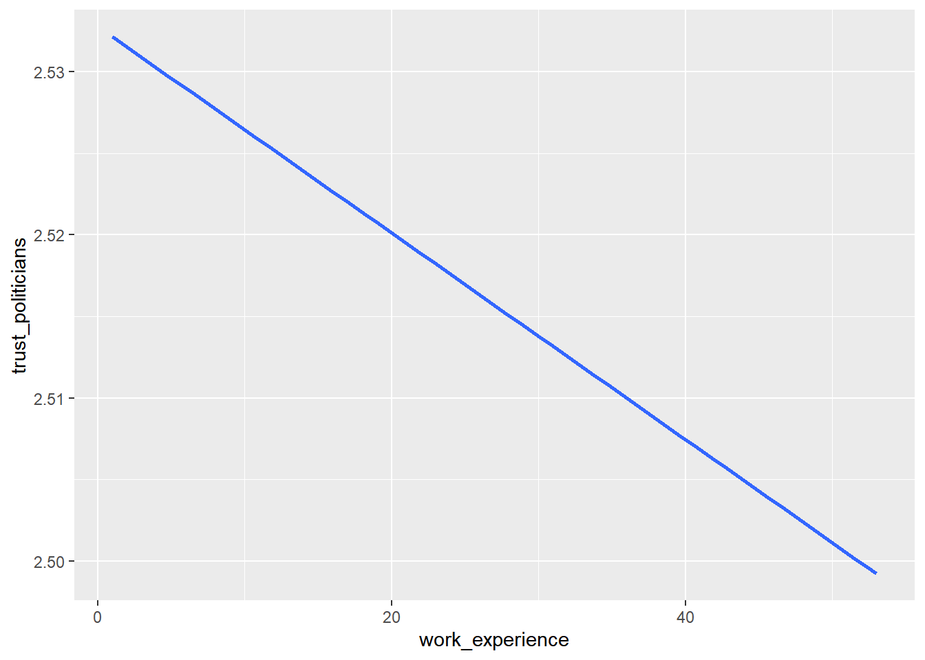
Now, display every country in a separate color by using the color
argument inside the aes() function.
Task 5
Add fitting labels to your plot. For example, set the main title to display: “Impact of Work Experience on Trust in Politicians”. The x-axis label should read “Years of Work Experience in Journalism”, and the y-axis label should read “Trust in Politicians on a 5-point Likert Scale”. The label for the color legend should be “Country”.